01
Begin with an occupation that suggests a shape
Otis is a lighthouse concierge. That gives the design two sources of visual information: weather protection and excessive formality. His triangular cape creates a broad top silhouette, while his polished boots make his seriousness visible. These are specific choices for a new character; you do not need the clothes or face of the character that inspired the exercise.
Draw a rough shape in words before listing materials: “a narrow figure beneath a broad triangular cape, standing upright with feet neatly together.” An occupation can help because it suggests posture and practical objects. Still, the shape must read without the job title. If you hide the caption, a viewer should recognize the same figure across different scenes.
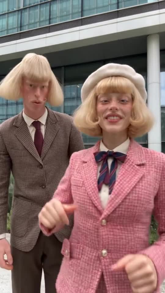
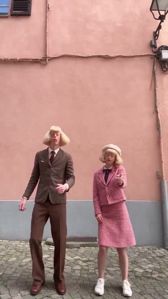 Observed reference · Jean + Clarabelle
02
Allocate one dominant color and one accent
Keep Otis mostly navy, with burgundy boots as the accent. White eyebrows draw attention to the face without becoming another wardrobe color. This gives you a hierarchy: large dark shape, small warm accent, light face detail. The choice is a design exercise, not a rule that every successful character needs exactly these colors.
Compare Beanie’s existing original art: the brown body, orange scarf and white gloves separate the parts of a simple mascot clearly. Use that separation as a reference for readability. When designing Otis, resist adding a bright tie, yellow hat and green umbrella together. If every object calls for attention, the audience cannot tell which feature identifies him.
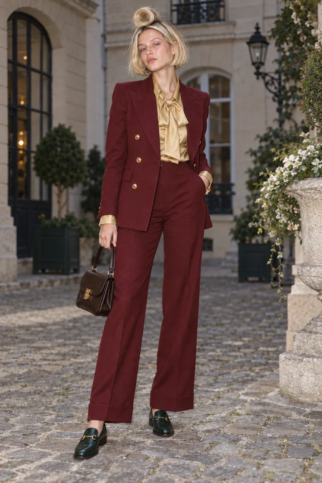
The artwork is our concept example. Your edited brief opens the real Character form; no drawing starts here.
03
Make the expression contrast with the circumstance
The expression rule is “patient courtesy in conditions that would make anyone else panic.” Otis is calmly holding a welcome card while a storm arrives. That contrast supplies the comic meaning; adding a huge grin would change the joke into enthusiasm. Write the emotional rule alongside the physical traits so later prompts preserve the intended relationship.
A useful review question is whether the situation creates the comedy without explanatory text. Test two versions of the same idea: Otis calmly straightening a doormat in heavy rain, and Otis grimacing at the rain. The first emphasizes misplaced professionalism. The second emphasizes ordinary discomfort. Pick the version that actually expresses your character’s belief.
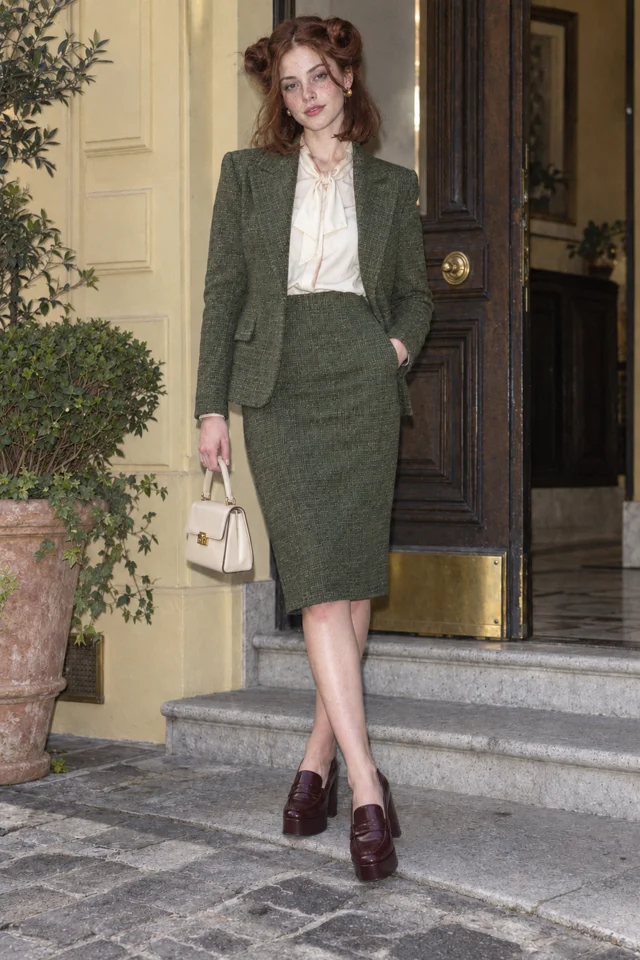
Every entrance is a runway.
Live action selected for this walkthrough. Choose your Look in the app; this inspector keeps the original reference artwork.
04
Separate identity traits from scene variables
Keep cape shape, eyebrow shape, boot color and posture fixed in the starting brief. Let location, weather and task vary. This separation stops a new scene prompt from becoming a new character design. For example, move Otis from the lighthouse door to a rocky jetty without changing the reference or introducing a different uniform.
A Look can intentionally change clothing while preserving the Character’s identity. Plan those variations after the base design reads well. A winter Look might replace the cape with a similarly broad coat, while retaining eyebrows and burgundy footwear. Inspect the new Image rather than assuming text alone guarantees the same face or proportions in every result.
ONE CHARACTER · TWO LOOKS
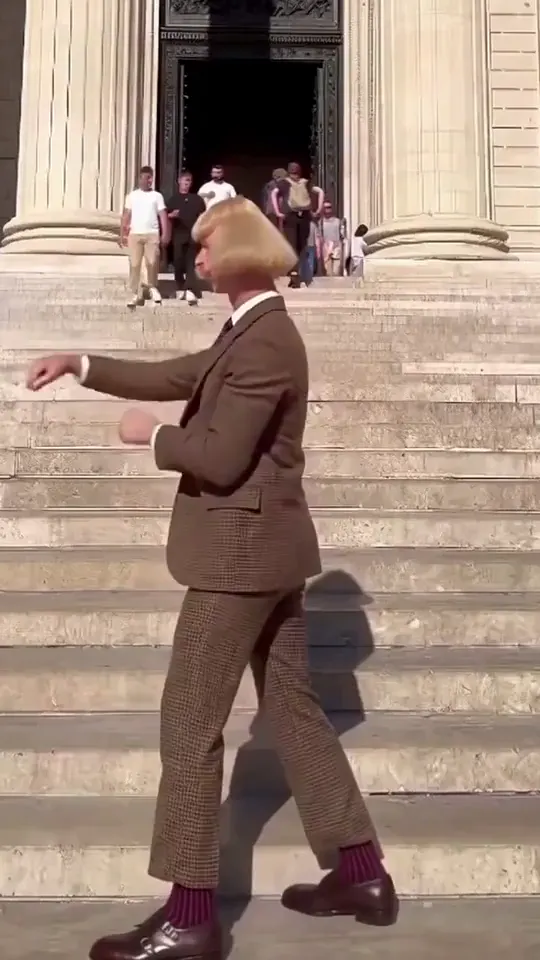
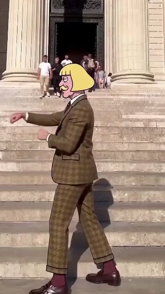
The identity stays. Only the Look changes: live action on the left, cartoon on the right.
05
Run a thumbnail test before adding decorative detail
Inspect the chosen portrait and a wider Image at a small size. Look for the dominant silhouette, face area and single accent. If Otis disappears against a dark sea, adjust the scene lighting or background before adding ten more costume details. Visibility often depends on the relationship between Character and setting, not just the Character itself.
Finish the design card with four lines: shape, palette, expression and repeated behavior. Otis’s behavior is welcoming inappropriate guests with impeccable manners. That card can support the next Clip or a larger World. It is complete enough to guide creation while leaving room for experimentation; it does not require a tool-specific prompt formula or a promise of flawless consistency.
Keep it sharp.
- Listing texture details before deciding what the silhouette should do.
- Using a new palette for every Image and losing the original visual anchors.
- Making the expression communicate the joke so loudly that the situation has nothing left to reveal.
Things you’re wondering.
How many visual anchors should I start with?
Start with two or three clear features you can recognize at small size. Add detail only when it improves the design rather than competing with those features.
Can I use a mascot instead of a realistic person?
Yes. The same shape, palette and expression exercise works for a fictional mascot. Match the design to the kind of story and physical action you want to make.
Should I draw a reference sheet?
A turnaround can help you compare the design from different angles. Use the available Draw a turnaround action when useful; keeping a Character does not automatically create one.
What if a signature prop disappears?
Review whether the prop is essential to the joke. Simplify the pose or scene and inspect a revised result rather than assuming every held object will remain correct.